
Scaling design systems
IBM SHARED SERVICES DESIGN SYSTEM
Reduced design and development efforts by increasing cross-product efficiency through common interaction patterns and design systems
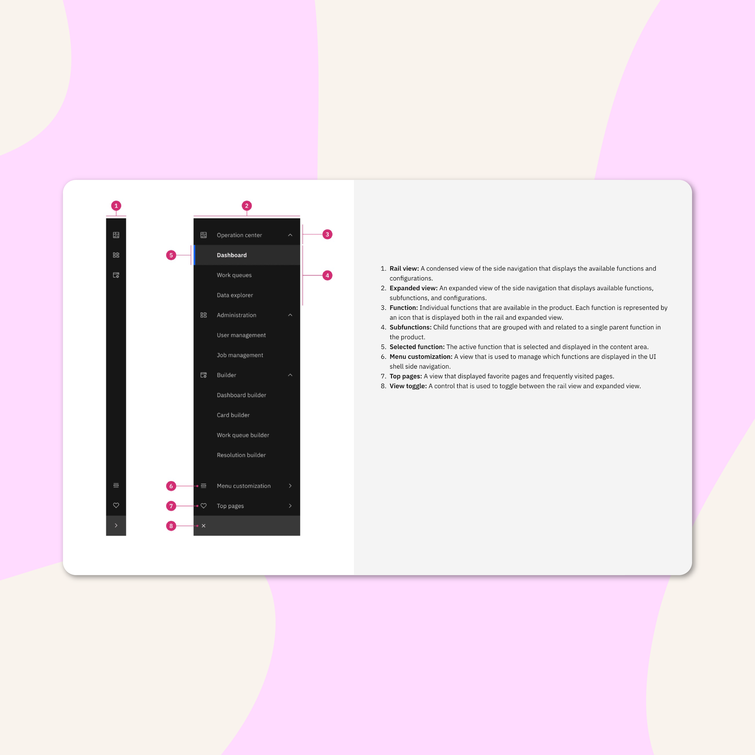
Example of published component guidelines for shared navigation.
What if product teams could innovate faster, without working longer hours? Our goal was to streamline design and development efforts across a myriad of applications within the Intelligence Suites and Sustainability Software portfolio. But how could we do it?
Through meticulous research, collaborative workshops, and relentless iteration, I led multiple teams to craft an extended and scalable ecosystem of interaction patterns, paving the way for enhanced efficiency and elevated user experiences. With each milestone achieved, we forged a path towards sustainability, accessibility, and excellence in design standards, leaving an indelible mark on IBM's design landscape.
Design Leadership, Design Systems, Cross-functional Partnerships, UX + Visual Design, Design Research
RESULTS
75%
Common use cases addressed
5
Designed for the needs of 5+ supply chain products
8
Added 8 new components, interaction patterns, and layouts to the IBM Pattern and Asset Library Design System
30%
Product design, development, and creation saw a 30% reduction in time spent
CHALLENGE
Historically, design and development teams continuously rebuilt components with overlapping functionalities for each product, leading to inefficiency and lack of consistency. Our goal was to drive the adoption of shared design patterns to reduce churn, improve efficiency, and promote a cohesive user experience while ensuring accessibility compliance and holding product teams to higher standards.
5 product teams + ~50 user tests + 6 months
= 8 scalable components and interaction patterns
ACTION
Lead with a collaborative approach.
A group of Design Leads, PMs, and Engineers across 5+ supply chain products and the Shared Services Pattern and Asset Library, came together for 16 weeks with a mission to enhance the design system for IBM's supply chain offerings.
We leveraged the existing IBM Carbon Design System, and ensured purposeful collaboration to maintain transparency, organize and understand unique product needs and requirements, and facilitate enterprise design thinking workshops to co-create alongside cross-functional teams. Our iterative process allowed us to test concepts quickly, and drive continuous improvement.
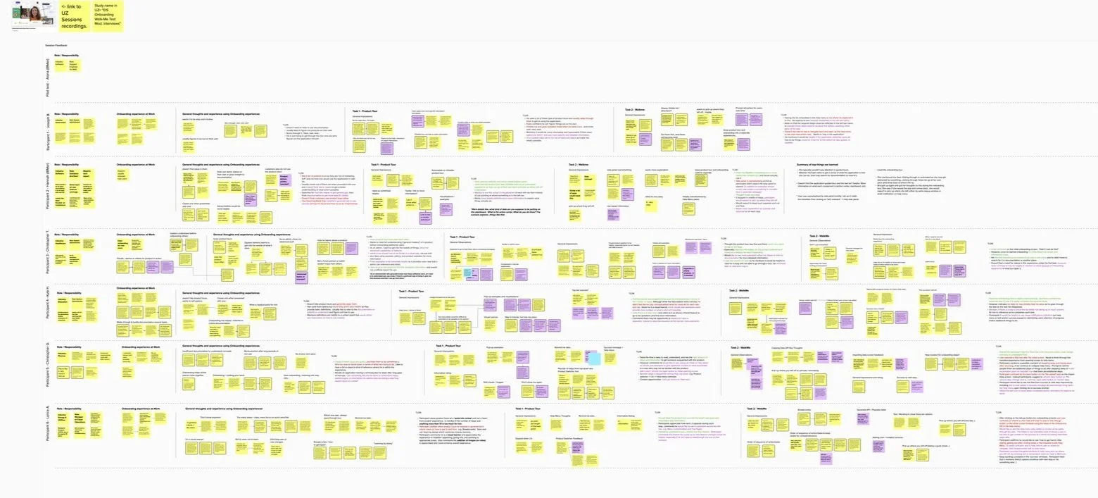
Auditing needs for 5 different supply chain products.
6 months of
Continuous iterations and conducting ~50+ user tests.
Playbacks with stakeholders and PAL teams.
Identifying scalable patterns to streamline and prioritize.

Aligning on product needs and prioritizing impact and feasibility alongside product teams.
We spent the first few weeks meeting daily to identify existing pain points and gaps in the current design system across the portfolio, as well as understand product needs and requirements.
Each team had different needs — but the goal remained this same – build flexible and scalable components that address our most used, common use cases.


Mural snippets of product audits to identify gaps, pain points and current + future needs. This sampling focuses on the navigation across various products within the supply chain portfolio.
We identified 8 common patterns and experiences that could be utilized across 5 different products.
We identified and designed potential solutions that catered to the highest priority use cases based on product roadmaps. We continuously iterated and tested variations of the solutions with users and refined daily.
HIGHEST PRIORITY NEEDS
Navigation component: The biggest lift considering existing functionality in order not to “break” existing products.
pRIORITY 1:
SHARED NAVIGATION
Onboarding pattern: Another heavy lift. We want users to be able to onboard faster so they can user the product faster. Products needed to be able to customize this to fit their specific needs.
pRIORITY 2:
SHARED ONBOARDING
Additional 6 patterns included: Log in/log out experiences, Suite product switcher, Advanced filtering and intelligent search, Chatbot assistant (relied heavily on AI capabilities and included enhancing natural language processing), Details pages, Work queues and work queue builder patterns


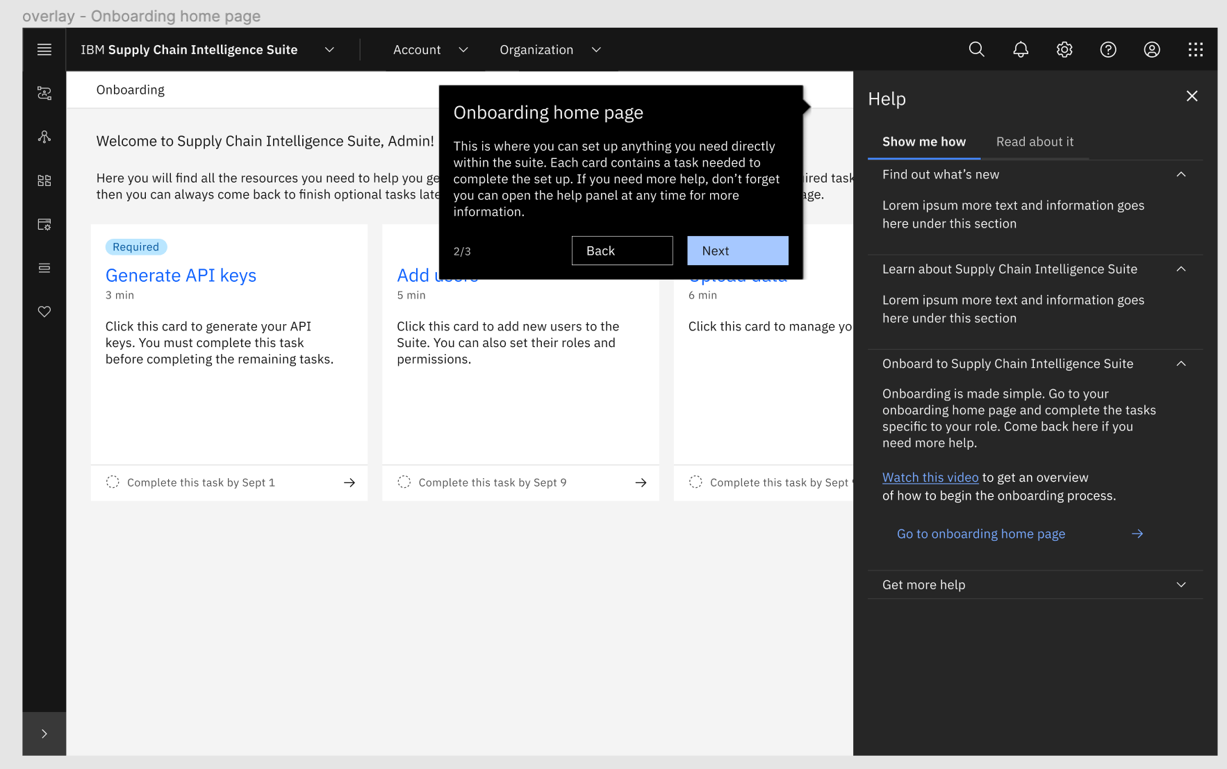
Left: Wireframe of a proposed solution for navigation. Middle: sampling of a few of the user tests we conducted with our prototypes. Right: Synthesized research from usability test from the admin onboarding testing.
We continuously iterated and tested concepts, keeping our stakeholders in the loop throughout the process. Sometimes, we even went back to the drawing board, literally.
We learned that shared navigation needed to be more flexible than we initially thought, in order to not disrupt existing product functionality. We also learned that admins preferred a checklist style of onboarding, something simple so they can get straight to the point and track where they are along the way.
This format also made it easier for our engineering teams to develop and customize for each product. The new navigation created the ability to go up to 4 levels deep, and the onboarding checklist created the ability to add or remove unnecessary steps without creating a lot of work.


Early onboarding ideation sketches and prototypes.
How challenging can a new navigation be?
Well, more challenging than you’d think. There were a few more pain points to consider.
Our initial number of 5 navigations quickly turned into 16+ navigations due to core products having the option of add-ons and applications. We also needed to consider flexibility in order not to “break” existing functionality of a specific order management product, future needs and product roadmaps, and inconsistent terminology.
Core products + application add-on variations.
CONSIDERATIONS
Be flexible when needed so we don’t “break” existing functionality.
Future product needs + product roadmaps.
Inconsistent terminology. We needed to rename commonly used items to ensure consistency across the suite.

One example of a single navigation multiplying was the Environmental Intelligence Suite. There were about 11 variations we needed to design for.
In 6 months, the shared services team created and contributed 8 patterns and interactions to the IBM Pattern and Asset Library, expanding the capabilities of the supply chain portfolio’s design system. We considered accessibility every step of the way to ensure usable components for a variety of users.
✨ Along the way, we made sure to keep the teams responsible for building and launching the components were engaged through regular playbacks. As the shared services team completed the designs, we guided and advised the PAL team in building the components and contributing to the adoption of new design system patterns across our portfolio with stakeholder support.
Contributions + highlights
Administrator onboarding + trial experience
Navigation
Log in / Log out experiences
Suite product switcher
Advanced filtering and intelligent search
Chatbot assistant (relied heavily on AI capabilities and included enhancing natural language processing)
Details pages patterns
Work queues and work queue builder patterns


Example of the delivered components to the PAL design system for shared navigation.
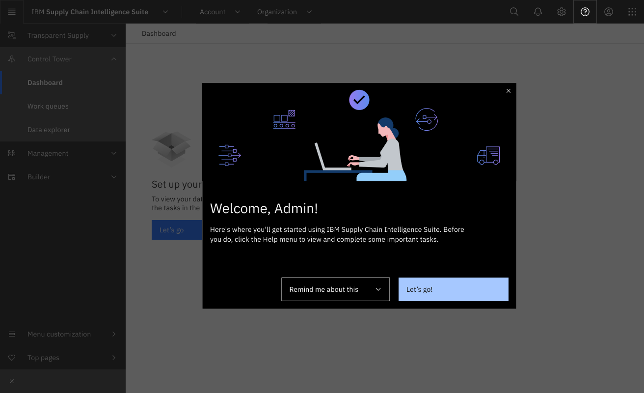
Prototype showcasing a simplified Admin Onboarding experience through a checklist.


Additional patterns and components delivered to IBM Pattern and Asset Design System.
Through our collaboration and innovation within the IBM Shared Services team, we've significantly enhanced and scaled the IBM Pattern and Asset Library. By contributing reusable components and patterns, we've not only improved the design system but also revolutionized the way our teams operate.
We've accelerated the speed and precision with which products are built, allowing for faster innovation, testing, and iteration. This not only saves time and resources but also contributes to a more sustainable future by reducing energy consumption. Most importantly, it leads to happier users who benefit from seamless and intuitive experiences.

30% reduced waste
Delivered 8 new components and interaction patterns, reducing design and development waste by up to 30%.

IMPROVED CUSTOMER SATISFACTION
Improved of overall customer satisfaction with consistent experiences across products and addressing 75% of common use cases, proven through usability testing.

POSITIVE influence
Promoted sustainability, usability best practices, and built-in accessibility, influencing product teams to communicate frequently and share user-friendly, reusable components.
© All images, UIs, and information copyright International Business Machines Corp.