
A scalable enterprise portal designed for franchise growth and operations
Abercrombie & fitch co. franchise portal
Streamlined global franchise operations with a scalable partner portal, doubling partner growth in eight months.

“Welcome to our Franchise Portal”—a unified space built to empower global partners from day one.
To expand globally, Abercrombie & Fitch Co. needed more than localized e-commerce sites. They needed a scalable, self-service platform that could support franchise partners in managing operations independently, while upholding brand consistency and regional compliance.
The Franchise Portal was our solution: a centralized internal tool designed to serve marketers, designers, and developers across global markets. It provided marketing teams with access to approved brand assets, equipped designers with Figma-based design system resources for seamless creative execution, and gave developers the tools to build and maintain region-specific sites.
By aligning cross-functional needs through a single experience, this work helped turn global expansion into a repeatable, scalable process, while doubling partner growth in just eight months.
End-to-End Design Strategy, Design Systems, Cross-Functional Partnerships, UX + Visual Design
Role:
Product Design Lead
Led the end-to-end design strategy, working across four cross-functional squads and directly with franchise partners to ensure the platform scaled effectively across global markets.
Responsibilities:
– Owned UX and UI design, planned and led user research and partner interviews, and audited partner sites prior to launch
– Facilitated collaboration across 4 product squads and international stakeholders
– Created wireframes, prototypes, and design specs in Figma, while considering localization, multilingual, and RTL requirements into designs
– Developed and documented reusable design patterns and evolved the corporate design system
– Partnered with PM and engineering to scope MVP and phased rollout
– Presented work to leadership and incorporated feedback
RESULTS
8 months
Successfully launched the MVP Franchise Portal, delivering a scalable platform to support global partner growth and operations
2x
Doubled the franchise partner network within six months of launch by providing tools and resources for operational efficiency
1 tool
Developed a self-service design auditing checklist, empowering franchise teams to work faster while maintaining brand consistency
6 BRANDS & PLATFORMs
Built a reusable design pattern adaptable across 6 brands and platforms, reducing design and development waste while maintaining consistency
~90 partners
Built a scalable foundation to grow from 2 to 90 global partners, driving long-term market expansion
CHALLENGE
Challenge One:
Design the Franchise Portal (Internal Platform) Itself From the Ground Up
Goal: Build a single, scalable internal tool for franchise partners to access brand-approved assets, design system resources, and developer APIs and support, while ensuring alignment with the A&F corporate design system.
VALIDATE ROADMAP + ALIGN *MULTIDISCIPLINARY TEAMS AND PARTNERS + DESIGN FOR SCALE + LAUNCH IN 8 MONTHS =
FRANCHISE PORTAL
*a multidisciplinary team that was new to working with UX
Challenge Two:
Create Scalable, Reusable Components (Global & Customer-Facing)
Goal: Support seamless geolocation-based redirects, translation, and error handling for customers shopping from franchise regions, while ensuring alignment across all A&F brands, platforms, and devices and supporting regional compliance.
process
DISCOVERY →
STRATEGY →
EXECUTION →
ITERATION →
DELIVERY
*including multidisciplinary collaboration every step of the way
*Every phase included close collaboration with product managers, engineers, the A&F design systems team, legal, business analysts, marketing, and direct partner feedback loops.
Challenge One: Designing the Franchise Portal
Identified Partner Needs: Conducted research sessions and discovery calls with franchise partners to understand how they were currently performing tasks, identifying gaps and unmet needs in their workflows.
*This was the first time design and research had been involved in the Franchise Portal project.


Notes from partner discovery sessions.
Roadmap & Workflow Validation: I kicked things off by validating the roadmap and mapping workflows. It quickly became clear that we had critical gaps—both in partner needs and internal requirements. Some workflows had never been defined, and many post-MVP needs were missing entirely.
To close these gaps, I led collaborative discovery sessions with product, engineering, legal, and marketing, surfacing pain points and clarifying ownership. I mapped five end-to-end workflows (like sign-in, help center, and ticket resolution) and used them to align the team on what needed to be built—and when.
Cross-functional alignment was key. I ran weekly meetings with product, engineering, legal, and design leads, created async update boards in Mural, and kept open feedback loops with both stakeholders and franchise partners.
I also conducted discovery sessions with franchise partners across regions to uncover unmet needs and clarify translation and compliance expectations (including RTL).


Examples of Figma designs showcasing the experiences and the workflow for the sign in workflows.
OUR KEY FINDINGS
Developers needed more than just access to APIs. They needed an embedded way to test, edit, and preview them directly within the portal.
Developer and marketing users needed a clear way to submit tickets with attachments, track their status, and understand resolution timelines.
Design the Experience: Once the groundwork was in place, I jumped into Figma. I designed the full portal experience: sign in/out flows, help center ticket logging and status tracking, help center, developer tools, and scalable navigation systems.
Each screen went through tight feedback loops with the design systems team, internal squads, and regional stakeholders. I utilized the corporate design system, and created new components that did not yet exist. Every new component was accessibility-tested, responsive, and built for reusability. I leaned into the loop of design → feedback → iteration to make sure the end experience felt intuitive and supportive.


Iterations of the various workflows showcasing progress over time. Gaps identified in pink highlight unanswered questions in the earliest version (far right workflows in each section). The latest iteration (far left workflows in each section) reflects a fully refined flow with all gaps addressed.
Franchise partners needed a fast, independent way to audit their work without relying on internal A&F designers. Without it, scaling from 2 to 90 partners would’ve created a massive bottleneck.
The initial requirements left major UX gaps. We had to rethink the experience from the ground up.
Franchise Portal (Internal Tool) Key Contributions:
Validated roadmap gaps by mapping every single workflow like sign-in/sign-out, permissions, and ticketing, etc
Designed net-new components missing from the design system (e.g., data table, status indicators, left-hand nav)
Prototyped internal ticketing tools to streamline feedback and reduce dependency
Created a self-service QA checklist to help partners audit their own builds
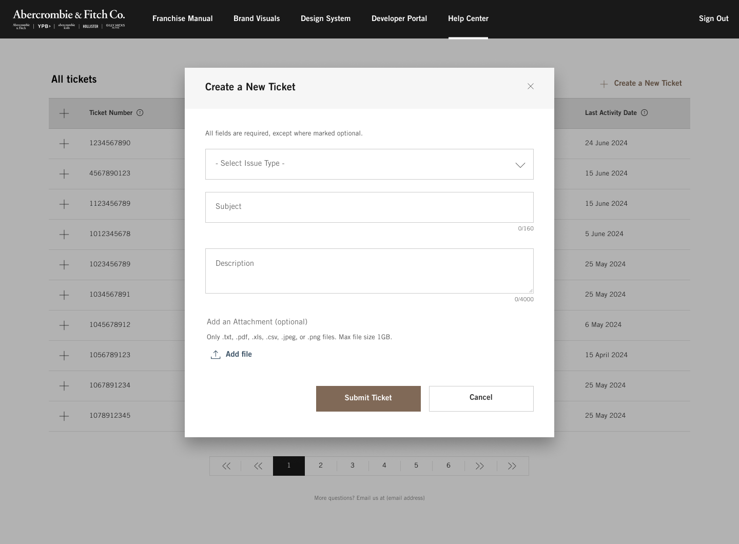
Creating a ticket workflow and history log. The data table and status indicator components were designed and tailored for B2B needs, which were missing from the existing A&F Corporate Design Library. Contributed them back to the design system for broader use.


Conducted a workshop with the design organization to gather feedback on pain points during handoffs and partner design audits. Combined insights from these sessions and personal auditing experience with Middle Eastern partners to create a self-service QA checklist. Gathered feedback from marketing, design leadership, and the design systems team before finalizing the checklist.

Challenge 2: Reusable Customer-Facing Design Assets
Validated Compliance, Feasibility, and Regional Logic Across Markets:
To redirect customers to the right partner site, we had to get the nuances right. I led compliance workshops with stakeholders from marketing, legal, and regional franchise teams to align on requirements, risks, and edge cases. That clarity work was essential to ensure the experience respected both regional agreements and user expectations.
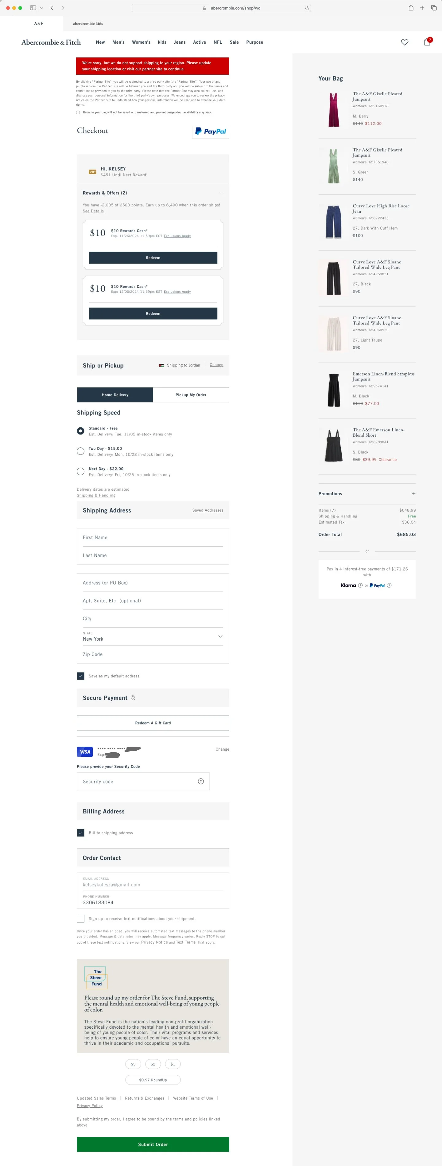
We needed a system that worked for everyone…across app, mobile, and desktop – for both new and returning users. That meant thinking through in-region shipping logic (like users in Oman delivering to Qatar), rare but important edge cases (like users in Bahrain sending a gift to the U.S.), and fallback flows that still preserved brand integrity.
The redirect needed to be flexible enough to honor regional constraints but consistent enough to feel seamless no matter where the user started. That balance of flexibility and cohesion became the core design challenge.
Cross-Squad Alignment: This work spanned multiple squads: browse/seek, purchase/cart, and app, since geolocation impacted everything from product discovery to final checkout. I partnered closely with stakeholders across legal, marketing, and our global partners to ensure the redirect logic held up under regional constraints, platform differences, and edge case behaviors.
Throughout, I kept a tight feedback loop going with PMs, developers, and design system collaborators across all A&F brands—Abercrombie, Abercrombie Kids, and Hollister. Weekly syncs and async updates helped us move quickly without missing key perspectives.
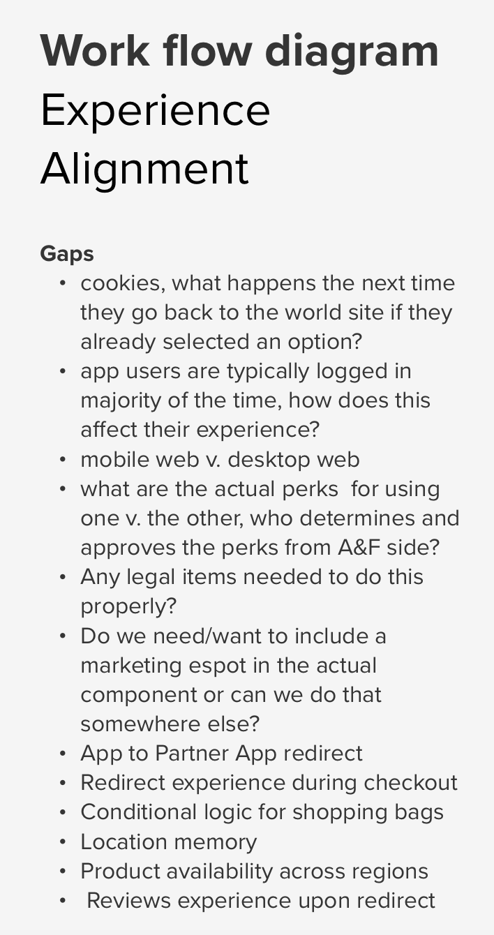


GAPS IDENTIFIED
Geolocation overlays needed to support both single-country and multi-country regional redirects.
Users required multiple, intuitive entry points to ensure successful redirection to partner sites.
Design Execution: Once the strategy was aligned, I jumped into Figma to map out flows and wireframes, designing experiences that worked across device types and account states. I prototyped and tested variations for geolocation overlays, fallback flows, and error scenarios, continuously iterating based on team and executive feedback until we had a flexible, scalable pattern we could roll out globally.

Various iterations of the geolocation overlay redirect experience workflows.
Some users bypassed overlays and still reached checkout on the global site—introducing the risk of failed orders. We had to design fallback mechanisms to keep them from getting stuck.
The experience needed to work seamlessly across desktop, mobile, and app platforms—for both new and returning users.

Early Figma design showcasing flow of geolocation redirect on the world desktop experience.
Reusable Global & Customer-Facing Design Assets Key Contributions:
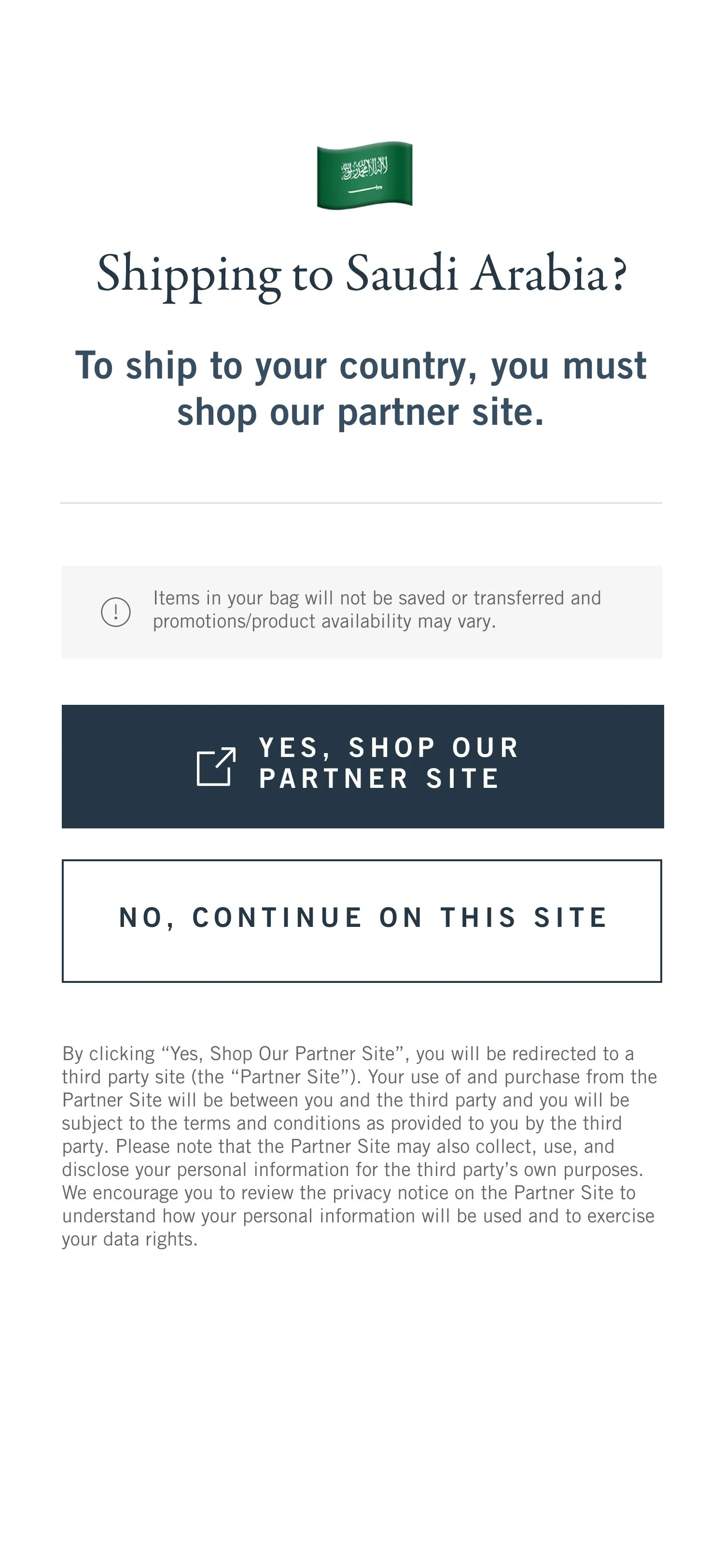
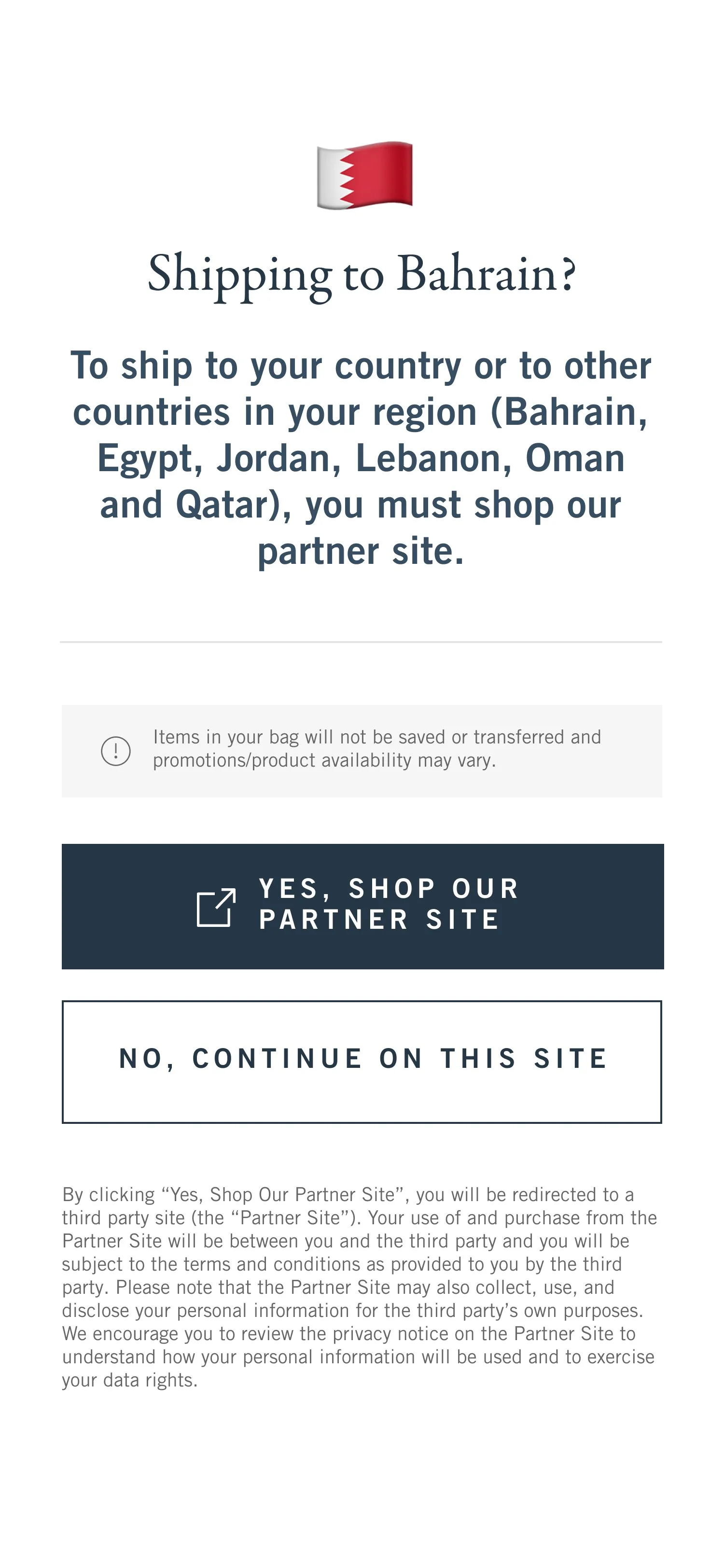
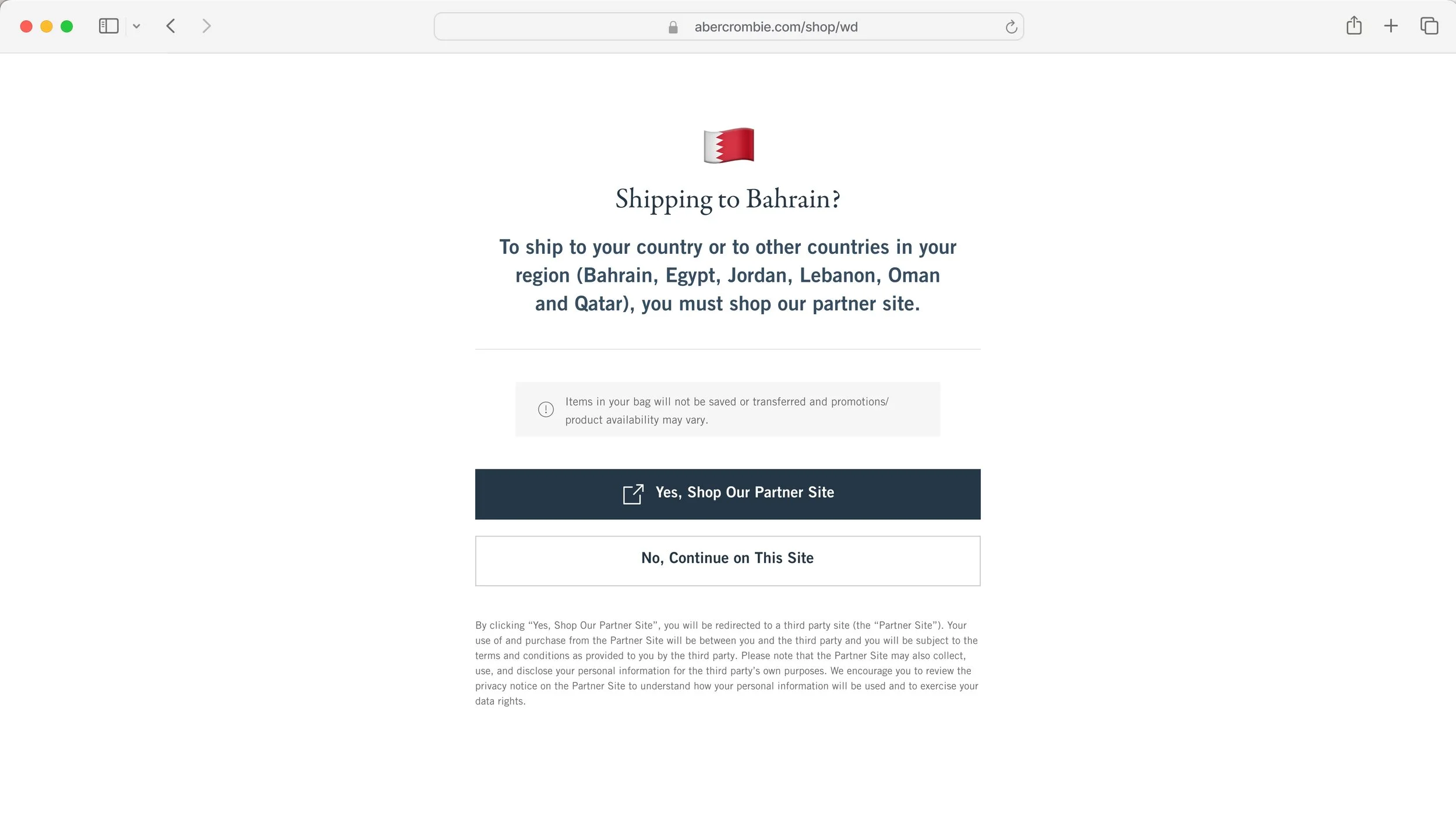
Designed modular overlays to guide users to regional partner sites (ex: “Shipping to Saudi Arabia?” pattern) and work across multiple brands and platforms (A&F, Kids, HCo, HCo Kids,etc)
Collaborated with the browse/seek, purchase/carts, and app squads to ensure seamless user experience and compliance
Supported translation workflows, RTL layouts, and legal disclaimers across multiple languages
Standardized regional messaging and created adaptable error messaging patterns that worked across devices, languages, and legal requirements
Collaborated with the design systems team to contribute components back into the corporate library

Reusable single country global overlay guiding customers to correct regional storefronts based on IP + legal constraints showing A&F Co and Hollister Co web and app experiences. Far right: Arabic experience featuring RTL layout and translated componenents.


Reusable global error messaging guiding customers to correct regional storefronts based on IP + legal constraints


Reusable multi country global overlay guiding customers to correct regional storefronts based on IP + legal constraints
In just 8 months, we released the first launch of the Abercrombie & Fitch Co. Franchise Portal.
We ensured our franchise partners were able to seamlessly pick up any assets they needed to immediately get started in building their regionally compliant e-commerce sites and QA themselves.
As the Franchise Portal launched, partners could hit the ground running without needing loads of support.
highlights
B2B components added to the design system
Global pattern for customer facing geolocation redirects
Scalable tools to empower independent partner QA
Cross-brand consistency across 6 brands


Our high-value MVP designs included the developer portal, ticketing system, and global pattern for customer facing geolocation overlays leading to the franchise partner sites.
Right-to-left support for Arabic markets
Fully launched MVP in 8 months
The Franchise Portal didn’t just streamline operations—it redefined global expansion.
Collaboration, strategic design, and a focus on empowering franchise partners defined the success of this project. The Abercrombie & Fitch Co. Franchise Portal created a scalable, self-service solution that accelerated partner growth, standardized brand consistency, and delivered operational efficiency across regions.

2x growth
Doubled the franchise partner network within eight months of launch by providing a centralized platform that gave partners direct access to the tools, design assets, and resources needed to streamline their operations and accelerate market entry.

90-partner roadmap
Built a scalable foundation designed to support long-term growth, expanding from 2 to 4 partners during the MVP phase with a clear path to reach 90 global partners through reusable design assets, standardized processes, and region-specific adaptations.

self-service enablement
Developed a self-service design auditing checklist and scalable tools, empowering franchise teams to maintain brand consistency and reduce design dependency. This initiative allowed partners to work more independently while ensuring quality and operational efficiency.
© All images, UIs, and information copyright Abercrombie & Fitch Co.